Architectural Design Presentations: how to give a convincing presentation?
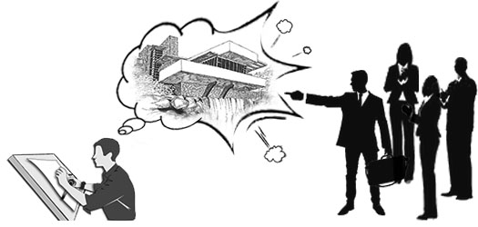
It is safe to claim that all architects are great designers but only a few are good at marketing it. And luckily it's not something someone should be good at naturally; with practice and identifying basic presentation flaws it's a skill that can be honed. In my opinion the important part of the design process of any project is not the designing or conceptualising of the project, but is the presentation of it. The clients seldom care about the design process and tend to focus on how it has been manifested and how it makes them feel, hence it's important to understand that a good design presentation can make or break a project. A concise presentation can put the client/ viewer in the designer’s shoes and make them see thoughts as you see them and also how the design has reflected the client’s vision too.
One can only imagine the pressure on the architect or a design student to deliver a convincing presentation. Their immediate response seems to be to get nervous; which is absolutely normal, but they tend to lose the aim of the presentation. The aim of a good presentation is actually quite uncomplicated: keep things simple, comprehensive and easy to understand. More often than not randomness and no clear flow to the presentation can make it seem like the design isn't well thought out. The only main goal of any presentation is to keep your viewers attentive and engaged. Nailing this step already moves you one step closer to a better presentation. Before focusing on points to improve, let's look at points to stay clear of in presentations. Sometimes these things are very simple and often overlooked, and identifying these can foster effective communication of the design.
The Don'ts
- Less is more.
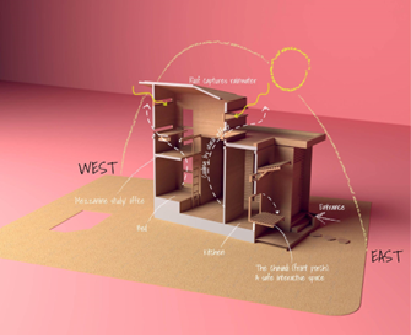
As much as we love to flex our fondness for writing, they are honestly less required on our design presentation sheets. We humans are very visual creatures, it's a primal instinct; so you may want to avoid putting in elaborate text descriptions because people may not want to read as much to understand your thought process. Visuals communicate the information in a better way as it's easier for the viewer to comprehend. For example in this diagram the effects of sun movement on the house and measures of passive heating/cooling which requires technical resolution and design skills could be simply represented in diagrams to explain it. Images and visuals get the viewers excited.
- Don't mix multiple presentation styles
Humans like to recognise patterns, so it's important to have a distinct presentation language to make it recognisable and familiar to the viewers. Like repeating a logo or following a presentation template. A distinct presentation style can demonstrate visual continuity and prove the involvement of the designers in the design process. It helps the viewers to familiarise, give uniformity and a clear sense of vision.
- Don't add everything you have.
This is an important point to note when you want to keep your viewers' attention without letting them trail off. It is often very tempting to showcase everything we have worked on proudly, it is not often viewed with the same enthusiasm. Some things are best kept aside for later discussions as a succinct presentation will open doors for various other conversations where this tucked away information can be brought forth.
- Don't make it monotonous.
Understand this simple rule while presenting slides: Chaos and Pause. Add a cluster of information in the beginning parts of the presentation like case studies and site analysis and then the slide after must have a full page spread 3D view of the final design. This breaks the monotony and jumps the viewer’s attention back up. It's the highlight point of the story that you want to give the most importance to. Negative pages have as much impact, if not, even more than pages with overloaded information.
- Don't seem underprepared.
Especially for regular client presentations, have all materials, models, etc. in handy. This gives an opportunity for the client to be haptic with the design process and feel involved. It can only be mastered effectively after multiple presentations and understanding the client’s specific needs.
The Do's
- Understand the audience.
Be it jurors or clients or students, understanding the audience helps target their likes, keeping them interested and leaving them satisfied. Same presentation methods might not work for every type of client, so each presentation is bespoke. If you present something entirely technical for a client then it renders the presentation moot because the client cannot connect with it, but if you just create something flashy with no actual technical detailing it again fails its function to provide appropriate information. The right balance between technical detailing and aesthetic images projects a relevant and accessible presentation.
- Own the design.
It's very important to convey your thoughts and ideas about the space or design. They're here to listen to how you add value to the project. So by giving your expertise, they can be fully convinced about your proposal. But it's always okay if they don't, because designing is a process and this presentation helps foster communication and development.
- Have an open mind.
Oftentimes in the professional field while working on large projects, stakeholders and the designers can get into a squabble about design decisions; and naturally the stakeholder has the upper hand. Designers tend to let their ego get the best of them during these times, which can lead to adverse outcomes. It's an important role of the designer to come to a compromise with the other party by standing by your design and making them see reason. Going into a presentation with an open mind can help take criticism constructively. Good presentation can foster healthy communication, strengthen relations and showcase your talent.
- Go the extra mile to make it a little nice.
Take that extra step to enhance the presentations, be it illustrating the plans or throwing in some sketches you worked on, it shows you really care about this and you're just as involved in the project as the client is. Concept sketches, diagrams, background research and elements of influence can illustrate the designer’s thought process and highlights the important part: showing that you're excited and you care.
- Show diagrams.
It's simple, effective and easy to comprehend. Make it a habit to express through diagrams and schematic sketches. Even animating arrows to show the circulation of air through the space, pedestrian/ vehicular movements, passive cooling etc. makes the presentation stand out and memorable.
- Use case studies.
To help strengthen your concepts/ design ideas, case studies can reinforce that. Inferences from that is all that matters to show how others have dealt with similar problems, as opposed to explaining the whole project. This is especially useful if you are presenting an academic work to a jury.
Steps to structure a presentation
Let us assume that the presentation being given is an amazing story being told, this is a great trick that could work wonders. And any good story has the following elements: Exposition, Rising Action, Climax, and Conclusion.
- Exposition: The setup is essential to convey the concept and context of the project. A short description of the problems being presented, what inspired you to come up with the ideas, concepts, etc.? This is an important step as it creates a hook to capture the audience because it leaves many open-ended questions that will seemingly be resolved in the third step of this process.
- Rising action: Showcase your sketches, diagrams, form development, conceptual models etc. to express your problem solving skills and address how the constraints from the previous point were tackled. Do not dwell in this phase for too long, the only important thing is to show the inferences and which specific element or idea has been used in your project as opposed to reading out everything about these case studies; as they are redundant to the viewer.
- Climax: All of these must lead to the climax which is the design intervention. The viewers will now fully be able to relate the concepts and other studies to the design with ease. This can be in the form of 3D views, a large detailed render, an illustration of the project, floor plans etc.
- Conclusion: Often very overlooked; can consist of closing statements, additional details and overall summary of the project. During client presentations this phase can be used to elucidate how certain requirements have been achieved and why some weren't or will be addressed during the next session. These help add an endnote to the presentation.
Different modes of presentations:
In the professional field there is no limit to how a design can be presented. Different modes of presentations can be employed at different stages of the design process, starting from a mood board for the preliminary concept stage to something as flamboyant as a VR interactive presentation in the final stage. And each mode of presentation conveys unique information. The following are a list of presentation methods to help understand its unique functions and help you choose what works best for your project. Some of these methods can be used interchangeably for the best results.
- 2D sketches and drawings.
The bread and butter of the architecture profession. This can be employed primarily during the design development stage. These are easy to make in a short span of time and harmless to make multiple revisions. They can convey information like dimensions, heights, spatial organisation, site context, proportions, hierarchy of shapes and overall composition. This is the easiest mode of communication between different interdisciplinary. You can take it up a notch by adding an artist touch to these 2D drawings by illustrating them on Photoshop or Illustrator thus making them more attractive.
- 3D models and Renders.
These are a staple in the architecture and design field now for it depicts the project close to its finished stage. 3D rendering software can also simulate daylighting into the space thus helping us understand how light affects the design, help understand the materials being used and help us make various design decisions in the 3 dimensional space. Sketchup, Revit and 3ds Max being the most popular modelling software and V-ray, Lumion, Enscape and Twinmotion provide the best rendering solutions out there.
Rendering software has evolved to a stage where they provide something called a Realtime render where the materials and textures of surfaces can be replaced whilst giving a client presentation without waiting a long time for a full render.
- AR (Augmented Reality).
Sometimes it is difficult to explain the implication of your thoughts through 2D drawings or even 3D models to clients, colleagues or people from other disciplines as it lacks pursuable feel of spaces. This is where Augmented Reality can help bridge that gap. It does so by overlaying your 3D models onto the real world site by means of your phones or tablets. Take for example this app called AR Sketchwalk for IOS. This app projects your floor plan on your iPad screen, while you hold your iPad up to walk in the direction you want to go in your plan, thus giving you a sense of the space.
This adds a new level of interactivity to the presentation and makes communication far easier.
- VR (Virtual Reality).
What's better than viewing your design in AR? Well, it’s virtually being in the design. VR has been the fastest growing visualisation field and it's no stranger in the architecture practice. A headset worn around the head puts the viewer directly into space giving them a whole different experience. Its real time render feature lets you move furniture around the space while your clients are in the virtual world trying to figure out what works best for them and what doesn't.
Hardware required are VR headsets like Oculus Rift, HTC Vive, Oculus Quest etc. and software that can run them like Enscape, Unity, etc. There has been immense growth in this field in just the past 5 years and are seemingly getting more exciting.
All of the points elucidated will mean nothing when they can't be presented under a stipulated time. This can be combated by practising the presentation extensively beforehand. To sum things up, characteristics of a good presentation is not an elaborate one but is one that is tailored to fit its intended audience.
About Writer:
Guruprasad is a young architect, who find solace in self-expression through writing. Forming his thoughts into words excites him and writing makes him feel like having long conversations with himself. He works as an architect in design firm that exclusively specialises in providing their services for Food and Beverage industry. On his off days he enjoys long hikes and making music. He is open to lengthy discourses with his peers about everything from architecture, writing, art and music. Guruprasad can be reached at: https://www.linkedin.com/in/guruprasad-h-78550a180

